responsibilities
Solo UI/UX Designer
Industry leaders study
Competitive usability testing, journey mapping
UX Design: Sketches, high fidelity screens and prototypes
UI design + iterations
Low and high fidelity usability testing
project information:
90 hour project designing under SubSpace’s specific business constraints.
Desktop-only to mobile version design to increase market reach and business.
A subscription dashboard mobile application that allows users to easily manage their subscriptions all within the application.
The problem
All we see is money deducted from our accounts for subscriptions that we might not need.
At SubSpace, customers to keep track of all of their subscription fees on websites, apps, services, etc. over the years. But our services are only available on desktop and we want to broaden our market reach and increase business.
The Solution
subspace mobile is ready for download!
Industry Leaders Study
Learning From the competition.
Studies were focused on how well Truebill, Trackmysubs, and Trim provides subscription management services and how easy it is to navigate to that service. We found that subscription services came second to the app’s primary function.
Competitive Usability Testing + Journey Map
I expanded on the industry leaders study with 5 competitive usability tests using Truebill to have users speak to their emotions through their experience. I compiled my notes into a Journey Map and Persona.
USER FLOWS
LET THE USERS MANAGE THEIR SUBSCRIPTIONS!
SubSpace flips the forumla - let users manage their subscriptions first, financial advisor features second with premium. SubSpace met three goals, which translated into our 3 user flows:
As a current user, I want to see all of my subscriptions in one place so that I can get a comprehensive view of my spending on subscriptions
As a returning user, I want to unsubscribe from a subscription so that I can reduce needless spending
As a consumer, I want to be notified if any of my subscriptions are about to be auto-renewed so that I can make a decision about if I want to renew the subscription and continue spending money.
design + iteration
transforming desktop serivces to mobile application.
I conducted 5 guerilla tests on sketches using Marvel – and the resounding find was that my Marvel prototype was overall lacking. Common statements were, “Transitions felt too fast,” and “I feel like I the application made the decision for me.”
5 usability tests were conducted on a high-fidelity prototype using FIGMA. The users were overall happy with their experience, however users had trouble viewing the screens because the text was too thin or too small. The priority with my first revision was to address the accessibility issue.
With great feedback from a plethora of sources, I iterated my design based on the desktop wireframes provided with these major improvements to note:
FINAL FRAMES
tHE FINAL PRODUCT
CLickable Prototype ver 1
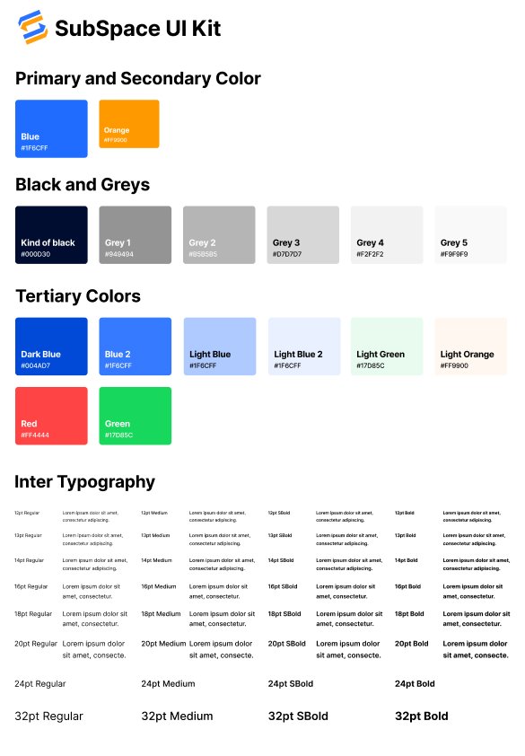
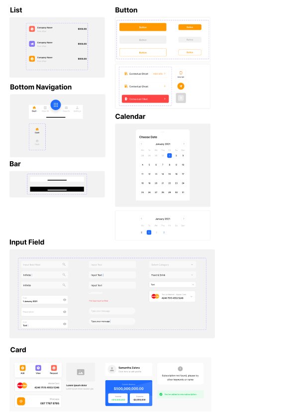
Style Guide
conclusion + Lessons learned
If you can think it, you can sketch it. I found myself omitting certain screens from sketches because I deemed it not as important as another. And not just on this project, but my previous ones as well. The beauty of sketches is that it’s fast, and it doesn’t have to be perfect. So if you thought about it, sketch it, because it doesn’t hurt to have more.
Objects seem closer than they appear. I create my high-fidelity designs in a fairly zoomed in screen (every pixel matters!). But don’t forget to zoom out, or create a mockup on the device of your choice, because what might seem easy to see, actually might not be. Accessiblity is key, and if the users can’t see it, the experience is poor from the start.
Design for the business, but for the people too. The business constraints presented a refreshing challenge because I had to satisfy both parties. It set limits for my design thinking but not so much where it was no longer my own, and that allowed the creative juices to flow and build a solution that was simple and efficient.
Practice, Practice, Practice. My design skills and thinking has improved since my first project, and each time I create I learn something new! Being able to decide what I thought was most effective in the design process this time was empowering, but also uncomfortable leaving out familiar steps like personas, or user interviews. I can see now more than ever how fluid the design process is, and how important it is to understand your users.
Next Steps
SubSpace is close, but not yet done. Now that I’ve iterated my high fidelity screens a second time, I’ll have to develop a second prototype so that I can do another set of usability tests to ensure I made the proper corrections to the user interface.
Before going in on the usability tests, I would also develop more of the interface such as the drop down bars on the “view all” page, so users can see how the interface changes when they choose monthly vs yearly, or sorting by price vice upcoming.
There's always room for improvement, but that’s the beauty of user interface and user experience design! Once I’ve compiled all the changes from the second round of usability tests, I would feel comfortable handing off to software engineer. Realistically I’d work with the software engineer throughout the process to ensure what I invision is something that is possible to code out, but in this instance as the sole UI/UX designer, I’m ready to make the changes!


